Does news coverage boost support for presidential candidates in the Democratic primary?
Matt Grossmann noted the close relationship between the amount of news coverage candidates in the Democratic primary have been receiving and their polling numbers.
Presidential candidate poll standing & prior week cable TV news share are correlated at .9
— Matt Grossmann (@MattGrossmann) September 27, 2019
Harris got a bump in news coverage after the 1st debate that faded with her polls; Warren's news coverage rose relative to Sanders with her polls; Biden leads both weekly pic.twitter.com/Z5njfyYdJg
This got me thinking about what the available data can bring to bear on this question. I have ongoing interest in longitudinal data and the software for analyzing it, so this seemed like a fun, quick project. Luckily, there are several great resources to take the pain out of data collection in this case.
The GDELT project offers a TV API that allows anyone to look at how much cable news channels mention the candidates (specifically, the number of 15-second windows of coverage that mention the candidate by name). Media Cloud also lets you look at how often candidates are mentioned in online news articles. Helpfully, the fine folks at FiveThirtyEight have compiled these data as well as polls, already.
Now I’m going to walk through how to get these data into R. Skip to the analysis by clicking here.
Getting the data
As mentioned, FiveThirtyEight has compiled most of the data we’re interested in, albeit in different places. We will read them into R as separate data frames and join them later. There are some warnings from the CSV parser but they aren’t important for our purposes.
library(tidyverse)
library(jtools)
library(tsibble)

cable_mentions <- read_csv("https://github.com/fivethirtyeight/data/raw/master/media-mentions-2020/cable_weekly.csv")
online_mentions <- read_csv("https://github.com/fivethirtyeight/data/raw/master/media-mentions-2020/online_weekly.csv")
# Immediately convert `end_date` to date class
polls <- read_csv("https://projects.fivethirtyeight.com/polls-page/president_primary_polls.csv")
Now we have the data, but we still have to get it in shape. First, we deal with the polls.
Polls
These data are formatted such that every row is a unique combination of candidate and poll. So if a poll included 20 candidates, there would be 20 rows to cover the results of that single poll. This is actually a good thing for our purposes.
I first create two vectors of candidate names. The first is the candidates who will be retained for analysis, in the format they are named in the polling data. The second is the same set of candidates, but with their less formal names that are used in the media data.
candidates <- c("Amy Klobuchar", "Andrew Yang", "Bernard Sanders",
                "Beto O'Rourke", "Bill de Blasio", "Cory A. Booker",
                "Elizabeth Warren", "Eric Swalwell", "Jay Robert Inslee",
                "Joe Sestak", "John Hickenlooper", "John K. Delaney",
                "Joseph R. Biden Jr.", "Julián Castro", "Kamala D. Harris",
                "Kirsten E. Gillibrand", "Marianne Williamson",
                "Michael F. Bennet", "Pete Buttigieg", "Seth Moulton",
                "Steve Bullock", "Tim Ryan", "Tom Steyer", "Tulsi Gabbard",
                "Wayne Messam")

candidates_clean <- c("Amy Klobuchar", "Andrew Yang", "Bernie Sanders",
                      "Beto O'Rourke", "Bill de Blasio", "Cory Booker",
                      "Elizabeth Warren", "Eric Swalwell", "Jay Inslee",
                      "Joe Sestak", "John Hickenlooper", "John Delaney",
                      "Joe Biden", "Julian Castro", "Kamala Harris",
                      "Kirsten Gillibrand", "Marianne Williamson",
                      "Michael Bennet", "Pete Buttigieg", "Seth Moulton",
                      "Steve Bullock", "Tim Ryan", "Tom Steyer",
                      "Tulsi Gabbard", "Wayne Messam")
Now we do some filtering and data cleaning for polls. See the inline comments
for some explanations, but basically we’re using only polls of known quality,
that cover the time period for which we have media data, and only national
polls.
polls <- polls %>%
  # Convert date to date format
  mutate(end_date = as.Date(end_date, format = "%m/%d/%y")) %>%
  filter(
    # include only polls of at least modest quality
    fte_grade %in% c("C-", "C", "C+", "B-", "B", "B+", "A-", "A", "A+"),
    # only include polls ending on or after 12/30/2018
    end_date >= as.Date("12/30/2018", "%m/%d/%Y"),
    # only include *Democratic* primary polls
    party == "DEM",
    # only include the selected candidates
    candidate_name %in% candidates,
    # only national polls
    is.na(state),
    # Exclude some head-to-head results, etc.
    notes %nin% c("head-to-head poll",
                  "HarrisX/SR Democrat LV, definite voter",
                  "open-ended question")
  ) %>%
  mutate(
    # Have to add 1 to the date to accommodate tsibble's yearweek()
    # starting on Monday rather than Sunday like our other data sources
    week = as.Date(yearweek(end_date + 1)) - 1,
    # Convert candidate names to factor so I can relabel them
    candidate_name = factor(candidate_name, levels = candidates, labels = candidates_clean)
  )
Now we aggregate by week, forming a weekly polling average by candidate. If we
were trying to build a forecast, we would do this in a better way that wouldn’t
have so much variation. For now, all I do is weight the results by
(logged) sample size. Note that pct refers to the percentage of the “votes”
the candidate received in the poll.
polls_agg <- polls %>%
  group_by(week, candidate_name) %>%
  summarize(
    pct_polls = weighted.mean(pct, log(sample_size))
  )
For a quick sanity check, let’s plot these data to see if things line up ( I omit the relatively lower-polling candidates for simplicity).
library(ggplot2)
top_candidates <- c("Joe Biden", "Elizabeth Warren", "Bernie Sanders",
                    "Pete Buttigieg", "Kamala Harris", "Beto O'Rourke",
                    "Cory Booker")
ggplot(filter(polls_agg, candidate_name %in% top_candidates),
       aes(x = week, y = pct_polls, color = candidate_name)) +
  geom_line() +
  theme_nice()
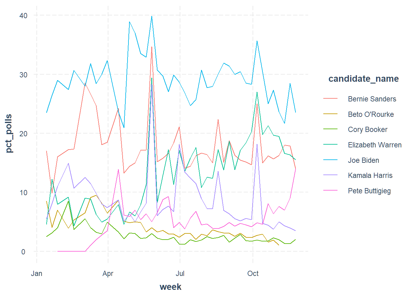
Okay, it’s a bit more variable than other aggregators but it’s showing us the same basic trends.
Media
We have two data frames with media coverage info, cable_mentions and
online_mentions. These are in much better shape to begin with, but we do need
to combine them and make a couple changes. Each row in these data represent
a candidate and week, so there are $weeks \times candidates$ rows.
This is a good example of a time to use an inner join. Note that our key variables are the proportion of all news clips/articles that mention any candidate that mention the candidate in question. In other words, we’re ignoring variation in how much the primary gets discussed in the news and instead focusing on how big each candidate’s share of the coverage is.
media <-
  inner_join(cable_mentions, online_mentions, by = c("date", "name")) %>%
  mutate(
    # Create new variables that put the media coverage variables on
    # same scale as poll numbers
    pct_cable = 100 * pct_of_all_candidate_clips,
    pct_online = 100 * pct_of_all_candidate_stories
  )
Let’s look at the trends for cable news…
library(ggplot2)
top_candidates <- c("Joe Biden", "Elizabeth Warren", "Bernie Sanders",
                    "Pete Buttigieg", "Kamala Harris", "Beto O'Rourke",
                    "Cory Booker")
ggplot(filter(media, name %in% top_candidates),
       aes(x = date, y = pct_cable, color = name)) +
  geom_line() +
  theme_nice()
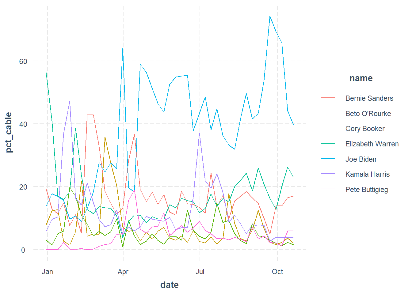
This looks a bit similar to the polling trends, although more variable over time.
And now online news…
library(ggplot2)
top_candidates <- c("Joe Biden", "Elizabeth Warren", "Bernie Sanders",
                    "Pete Buttigieg", "Kamala Harris", "Beto O'Rourke",
                    "Cory Booker")
ggplot(filter(media, name %in% top_candidates),
       aes(x = date, y = pct_online, color = name)) +
  geom_line() +
  theme_nice()
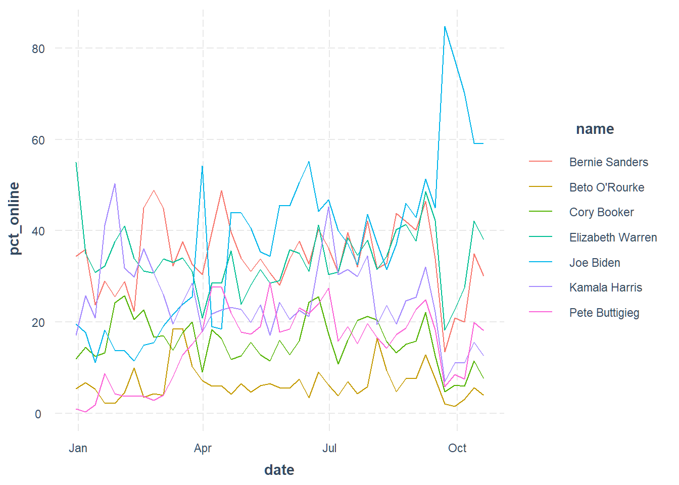
This one’s a bit more all over the place, with the minor candidates espcially having higher highs.
Combine data
Now we just need to get all this information in the same place for analysis. More inner joins!
joined <- inner_join(polls_agg, media,
                     by = c("candidate_name" = "name", "week" = "date"))
Now we have everything in a single data frame where each row represents one
week and one candidate. To make things work for statistical analysis, I’m going
to do a couple conversions — one to the panel_data format, from my
panelr package, and another to pdata.frame format, from the plm package.
We’ll be using both packages for analysis.
library(panelr)
# panel_data needs a number or ordered factor as wave variable
joined$wave <- as.ordered(joined$week)
joined_panel <- panel_data(ungroup(joined), id = candidate_name, wave = wave)
joined_pdata <- as_pdata.frame(joined_panel)
Analysis
Okay, so we have multiple time series for each candidate: their status in the polls, how much of the cable news coverage they’re getting, and how much of the online news coverage they’re getting. We’d like to know whether any of these are causing the others. Most interesting is whether the news coverage drives better results in the polls.
The kind of analyses we can do all have in common the idea of comparing each candidate to himself or herself in the past. If Elizabeth Warren’s share of news coverage goes from 10% to 12%, up 2 percentage points, where do we expect her share in the polls to go? If it goes from 15% to 17%, then it goes up 2 percentage points as well. This is treated equivalently to if Andrew Yang goes from 0% of news to 2% of news and then sees his polls goes from 1% to 3%.
Of course, this still doesn’t sort out the problem of reverse causality. If we see that news coverage and polls change at the same time, it’s not obvious which caused the other (and we’ll ignore the possibility that something else caused both for the time being). There are several methods for dealing with this and I’ll focus on ones that use past values of polls to predict future ones.
Fixed effects models
Fixed effects models are a common way to remove the influence of certain kinds of confounding variables, like a candidate’s pre-existing popularity. It doesn’t fix the problem of confounders that change over time (like a change in the candidate’s campaign strategy or a new scandal), but it’s a workhorse model for longitudinal data.
The process we’re looking at is dynamic, meaning candidates’ support in the past affects the present; people don’t pick their favorite candidate every week, they have a favorite candidate who will remain in that position unless something changes. We model this statistically by using last week’s polling average as a predictor of this week’s polling average. In the panel data literature, using so-called fixed effects models with a lagged value of the dependent variable in the model is a big no-no. This is because something called Nickell bias, which basically means that models like this give you wrong results in a predictable way.
Luckily, these data are not quite the same as the kind that the Nickell bias affects the most. We have 24 candidates with up to 38 weeks of data for each. The Nickell bias tends to be most problematic when you have relatively few time points and relatively many people (in this case candidates). So we’ll start with fixed effects models and assume the Nickell bias isn’t too serious.
I’m going to use the wbm() function from my panelr package to do this
analysis.
fix_mod <- wbm(pct_polls ~ lag(pct_polls) +
                 pct_cable + lag(pct_cable) +
                 pct_online + lag(pct_online),
               data = joined_panel, model = "fixed")
summary(fix_mod)
MODEL INFO:
Entities: 24
Time periods: 2019-01-13-2019-09-15
Dependent variable: pct_polls
Model type: Linear mixed effects
Specification: within

MODEL FIT:
AIC = 2233.15, BIC = 2269.64
Pseudo-R² (fixed effects) = 0.03
Pseudo-R² (total) = 0.98
Entity ICC = 0.98

-------------------------------------------------------------
                         Est.   S.E.   t val.     d.f.      p
--------------------- ------- ------ -------- -------- ------
(Intercept)              3.85   1.45     2.65    23.01   0.01
lag(pct_polls)           0.64   0.03    24.74   678.01   0.00
pct_cable                0.08   0.01     6.29   678.01   0.00
lag(pct_cable)           0.05   0.01     4.05   678.01   0.00
pct_online              -0.03   0.01    -2.29   678.01   0.02
lag(pct_online)         -0.02   0.01    -1.39   678.01   0.17
-------------------------------------------------------------

p values calculated using Satterthwaite d.f.

RANDOM EFFECTS:
------------------------------------------
     Group         Parameter    Std. Dev.
---------------- ------------- -----------
 candidate_name   (Intercept)     7.108
    Residual                      1.007
------------------------------------------
Here’s what the output is saying:
- First of all, there’s evidence of momentum. If your poll numbers went up last week, all else being equal they’ll probably be up this week too.
- Gains in cable news coverage both this week and last week are associated with gains in the polls this week.
- Gains in online news coverage this week are associated (very weakly) with declines in the polls this week, assuming no change in cable news coverage.
I will note that as far as the online coverage is concerned, if I drop cable news coverage from the model then suddenly online coverage appears to have a positive effect. I think what’s going on there is both online and cable news cover candidates in a way that helps them, but online coverage is sometimes harmful in a way that is not true of cable coverage. Either that or there’s just a lot more noise in the online data.
Adjusting for trends
This was the simplest analysis I can do. I can also try to remove any trends in the data to try to account for something that isn’t in the model that drives some candidates up or down over time. Basically, for each candidate we subtract their over-time trend from each week’s polling numbers and news coverage and see if deviations from their trend predict each other.
The risk with this approach is that it really is news that has most of the influence and you’re modeling away some of the “real” effects along with the stuff you don’t want around.
fix_mod <- wbm(pct_polls ~ lag(pct_polls) +
                 pct_cable + lag(pct_cable) +
                 pct_online + lag(pct_online),
               data = joined_panel, model = "fixed",
               detrend = TRUE)
summary(fix_mod)
MODEL INFO:
Entities: 24
Time periods: 2019-01-13-2019-09-15
Dependent variable: pct_polls
Model type: Linear mixed effects
Specification: within

MODEL FIT:
AIC = 2169.99, BIC = 2206.48
Pseudo-R² (fixed effects) = 0.91
Pseudo-R² (total) = 0.97
Entity ICC = 0.7

-------------------------------------------------------------
                         Est.   S.E.   t val.     d.f.      p
--------------------- ------- ------ -------- -------- ------
(Intercept)              1.01   0.34     2.95    16.39   0.01
lag(pct_polls)           0.69   0.02    29.60   339.36   0.00
pct_cable                0.08   0.01     6.43   683.75   0.00
lag(pct_cable)           0.04   0.01     3.52   688.28   0.00
pct_online              -0.03   0.01    -2.11   692.90   0.04
lag(pct_online)         -0.01   0.01    -1.00   690.93   0.32
-------------------------------------------------------------

p values calculated using Satterthwaite d.f.

RANDOM EFFECTS:
------------------------------------------
     Group         Parameter    Std. Dev.
---------------- ------------- -----------
 candidate_name   (Intercept)     1.559
    Residual                      1.012
------------------------------------------
Okay, same story here. Some good evidence of cable news helping and some very weak evidence of online news possibly hurting.
Driven by minor candidates?
Responding to Grossmann’s tweet, Jonathan Ladd raises an interesting question:
[The tweet has since been deleted, but it read:]
I wonder how much of this is driven only by the non-Biden candidates, since it seems to show that much of poll movement is driven by name recognition and need to coordinate on a non-Biden alternative.
There are a couple of ways to look at this. First of all, let’s think about this as less of a Biden vs. all others phenomenon and more about whether this effect of news on candidate support is concentrated among those with relatively low support.
We can deal with this via an interaction effect, seeing whether the effects are stronger or weaker among candidates with higher/lower absolute levels of support. I need to fit a slightly different model here to accommodate the inclusion of the lagged dependent variable without subtracting its mean (as is done for the conventional fixed effects analysis). Our focus will be on the “within” effects and cross-level interactions in the output below.
int_mod <- wbm(pct_polls ~
                 pct_cable + lag(pct_cable) +
                 pct_online + lag(pct_online) | lag(pct_polls) |
                 lag(pct_polls) * pct_cable +
                 lag(pct_polls) * lag(pct_cable) +
                 lag(pct_polls) * pct_online +
                 lag(pct_polls) * lag(pct_online),
               data = joined_panel, model = "w-b")
summary(int_mod)
MODEL INFO:
Entities: 24
Time periods: 2019-01-13-2019-09-15
Dependent variable: pct_polls
Model type: Linear mixed effects
Specification: within-between

MODEL FIT:
AIC = 2109.28, BIC = 2173.14
Pseudo-R² (fixed effects) = 0.98
Pseudo-R² (total) = 0.98
Entity ICC = 0.21

WITHIN EFFECTS:
-------------------------------------------------------------
                         Est.   S.E.   t val.     d.f.      p
--------------------- ------- ------ -------- -------- ------
pct_cable                0.09   0.02     4.68   672.05   0.00
lag(pct_cable)           0.02   0.02     1.20   671.39   0.23
pct_online              -0.01   0.02    -0.54   673.16   0.59
lag(pct_online)          0.04   0.02     2.55   672.97   0.01
-------------------------------------------------------------

BETWEEN EFFECTS:
---------------------------------------------------------------
                           Est.   S.E.   t val.     d.f.      p
----------------------- ------- ------ -------- -------- ------
(Intercept)               -0.16   0.17    -0.92    18.51   0.37
imean(pct_cable)           0.31   0.03     9.27    38.40   0.00
imean(pct_online)          0.00   0.02     0.03    17.29   0.98
lag(pct_polls)             0.63   0.02    26.58   589.12   0.00
---------------------------------------------------------------

CROSS-LEVEL INTERACTIONS:
----------------------------------------------------------------------------
                                        Est.   S.E.   t val.     d.f.      p
------------------------------------ ------- ------ -------- -------- ------
pct_cable:lag(pct_polls)                0.00   0.00     0.43   671.50   0.67
lag(pct_cable):lag(pct_polls)           0.00   0.00     4.05   674.01   0.00
pct_online:lag(pct_polls)              -0.00   0.00    -2.20   671.51   0.03
lag(pct_online):lag(pct_polls)         -0.01   0.00    -5.66   674.15   0.00
----------------------------------------------------------------------------

p values calculated using Satterthwaite d.f.

RANDOM EFFECTS:
------------------------------------------
     Group         Parameter    Std. Dev.
---------------- ------------- -----------
 candidate_name   (Intercept)    0.4972
    Residual                      0.955
------------------------------------------
Okay so there’s a lot going on here. First of all, we see that the instantaneous effect of changes in cable news coverage does not appear to depend on the candidate’s previous standing in the polls. For the other interaction terms, we have some evidence of the effects changing depending on the candidate’s standing in the polls.
Let’s examine them one by one, with help from
my interactions package. I’ll show predicted values of poll numbers depending
on different values of news coverage to give a gist of what’s going on.
Last week’s cable news coverage
Each line represents the predicted standing in this week’s polls at different levels of last week’s standing in the polls. What we really care about is the slope of the lines.
library(interactions)
interact_plot(int_mod, `lag(pct_cable)`, `lag(pct_polls)`,
              modx.values = c(2, 10, 20),
              x.label = "Last week's % change in cable news coverage",
              y.label = "This week's polling average",
              legend.main = "Last week's polling average")
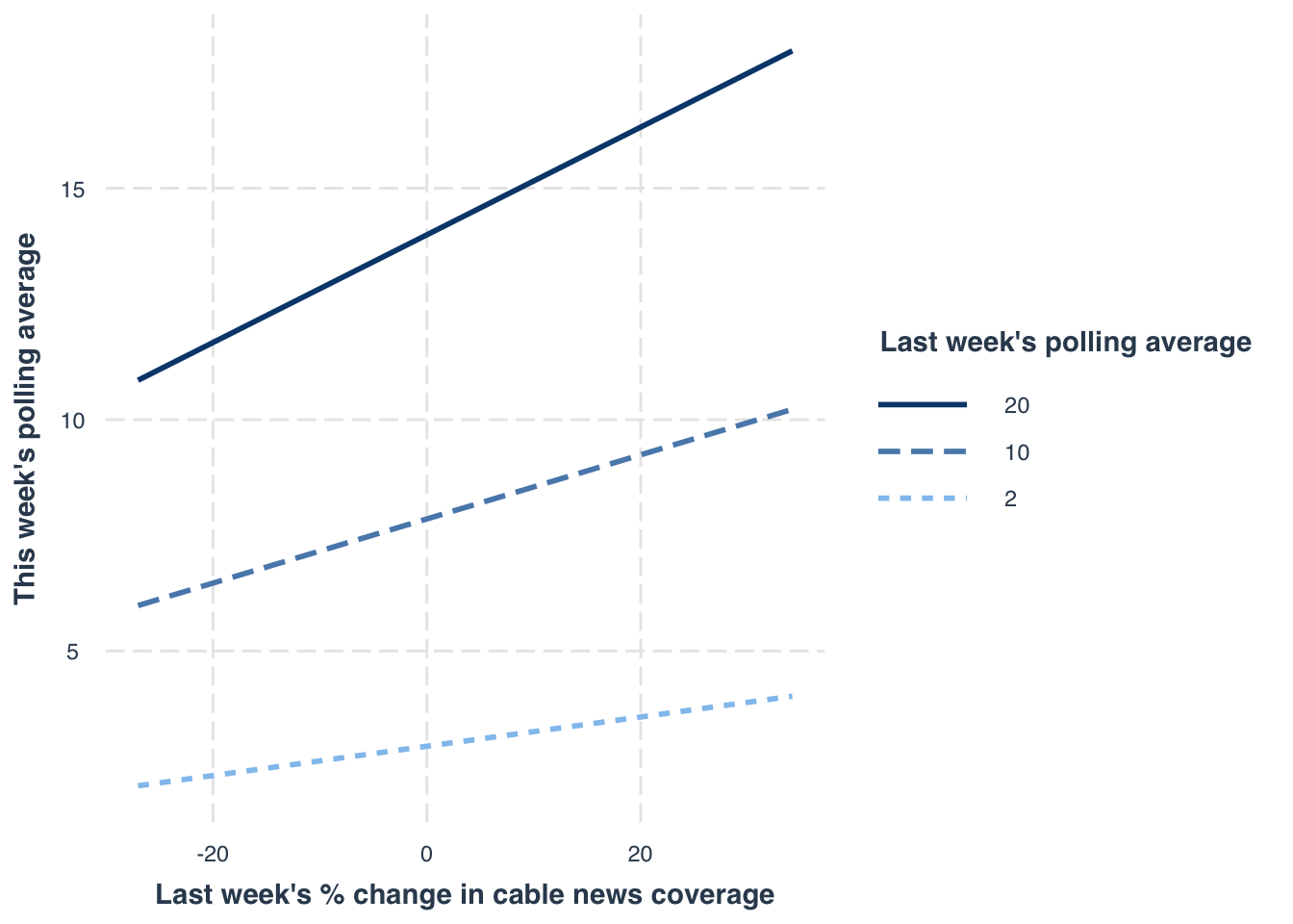
So what we see here is that the higher a candidate’s standing in the polls, the more they benefit from news coverage! This stands somewhat in contradiction to Ladd’s speculation. Another way to think about it is that these changes in news coverage tend to have more staying power for candidates with more support.
Last week’s online coverage
For last week’s online coverage, we see in the model output that for a candidate with hypothetical zero polling support, increases in online news coverage are good for future polling, but there’s a negative interaction term. Let’s look at how that plays out.
interact_plot(int_mod, `lag(pct_online)`, `lag(pct_polls)`,
              modx.values = c(2, 10, 20),
              x.label = "Last week's % change in online news coverage",
              y.label = "This week's polling average",
              legend.main = "Last week's polling average")
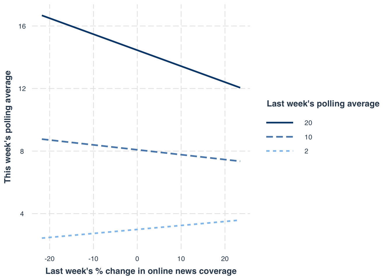
Here we see that for higher polling candidates, the lagged changes in online coverage are a detriment while for lower polling candidates, such changes are a much-needed (small) boost.
This week’s online coverage
Let’s do the same test with the effect of this week’s online coverage on this week’s polls.
interact_plot(int_mod, pct_online, `lag(pct_polls)`,
              modx.values = c(2, 10, 20),
              x.label = "This week's % change in online news coverage",
              y.label = "This week's polling average",
              legend.main = "Last week's polling average")
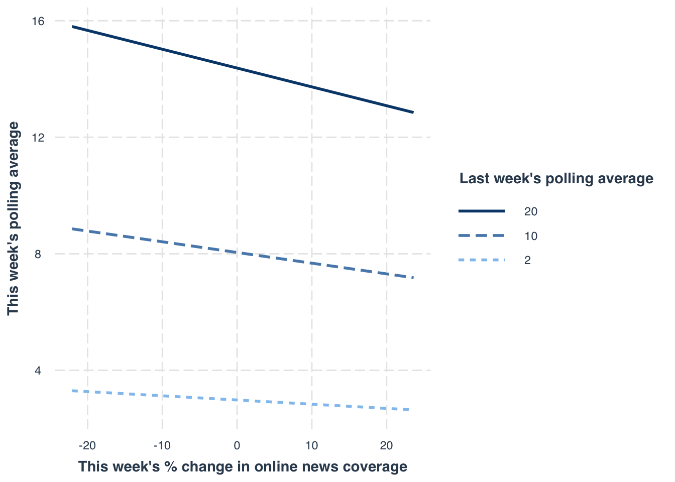
Quite similar to last week’s online coverage, except not even the low-polling candidates seem to benefit.
Just drop Biden from the analysis
Another thing we can do is just drop Biden, who for most of the campaign cycle has dominated the polls and news coverage.
no_biden <- wbm(pct_polls ~ lag(pct_polls) +
                 pct_cable + lag(pct_cable) +
                 pct_online + lag(pct_online),
               data = filter(joined_panel, candidate_name != "Joe Biden"),
               model = "fixed")
summary(no_biden)
MODEL INFO:
Entities: 23
Time periods: 2019-01-13-2019-09-15
Dependent variable: pct_polls
Model type: Linear mixed effects
Specification: within

MODEL FIT:
AIC = 1879.42, BIC = 1915.49
Pseudo-R² (fixed effects) = 0.07
Pseudo-R² (total) = 0.97
Entity ICC = 0.96

-------------------------------------------------------------
                         Est.   S.E.   t val.     d.f.      p
--------------------- ------- ------ -------- -------- ------
(Intercept)              2.70   0.92     2.93    22.01   0.01
lag(pct_polls)           0.65   0.02    26.80   643.01   0.00
pct_cable                0.10   0.01     7.91   643.02   0.00
lag(pct_cable)           0.04   0.01     2.98   643.01   0.00
pct_online              -0.02   0.01    -1.92   643.02   0.05
lag(pct_online)          0.01   0.01     1.30   643.01   0.20
-------------------------------------------------------------

p values calculated using Satterthwaite d.f.

RANDOM EFFECTS:
------------------------------------------
     Group         Parameter    Std. Dev.
---------------- ------------- -----------
 candidate_name   (Intercept)     4.414
    Residual                     0.8483
------------------------------------------
And in this case, the results are basically the same, although the benefits of news coverage are perhaps a bit stronger.
A more advanced model
Let’s push a bit further to make sure we’re not making a mistake on the basic claim that (cable) news coverage appears to be beneficial. A more robust approach is to use an analysis that more deliberately addresses these issues of reverse causality and endogeneity.
Normally, I’d reach for the dynamic panel
models featured in my dpm package, but these can’t handle data with so many
time points and so few people. Instead, I’ll use the
Arellano-Bond estimator1,
which the models in dpm were meant to replace — they are both unbiased,
but Arellano-Bond models tend to be inefficient. In other words, this method
is more conservative.
For this, I need the plm package and its pgmm() function. I’ll skip the
technicalities and just say the interpretations will be similar to what I just
did, but the underlying algorithm is more rigorous at ruling out reverse
causality.
library(plm)
ab_mod <- pgmm(pct_polls ~ lag(pct_polls, 1) +
                         pct_cable + lag(pct_cable) +
                         pct_online + lag(pct_online) |
                         lag(pct_polls, 2:15),
               data = joined_pdata, effect = "individual", model = "twosteps",
               transformation = "ld")
summary(ab_mod)
Oneway (individual) effect Two steps model

Call:
pgmm(formula = pct_polls ~ lag(pct_polls, 1) + pct_cable + lag(pct_cable) +
    pct_online + lag(pct_online) | lag(pct_polls, 2:15), data = joined_pdata,
    effect = "individual", model = "twosteps", transformation = "ld")

Unbalanced Panel: n = 24, T = 11-37, N = 731

Number of Observations Used: 1361

Residuals:
     Min.   1st Qu.    Median      Mean   3rd Qu.      Max.
-11.44106  -0.27460   0.00000  -0.00144   0.25889   9.50637

Coefficients:
                    Estimate Std. Error z-value  Pr(>|z|)
lag(pct_polls, 1)  0.8953903  0.0196164 45.6449 < 2.2e-16 ***
pct_cable          0.0741411  0.0165264  4.4862  7.25e-06 ***
lag(pct_cable)     0.0109705  0.0065706  1.6696   0.09499 .
pct_online        -0.0108026  0.0120645 -0.8954   0.37057
lag(pct_online)    0.0095829  0.0140126  0.6839   0.49405
---
Signif. codes:  0 '***' 0.001 '**' 0.01 '*' 0.05 '.' 0.1 ' ' 1

Sargan test: chisq(437) = 18.55703 (p-value = 1)
Autocorrelation test (1): normal = -2.282824 (p-value = 0.022441)
Autocorrelation test (2): normal = -1.182395 (p-value = 0.23705)
Wald test for coefficients: chisq(5) = 146865.5 (p-value = < 2.22e-16)
Okay so what does this all mean? Basically, the same story we saw with the other, simpler analyses.
Conclusions
Does news coverage help candidates in the Democratic primary race? Probably. There are some limitations of the analyses at hand. It is possible, for instance, that there is something else that changes the news coverage. In fact, that is likely — early on, it appeared Elizabeth Warren drove news coverage by releasing new policy proposals on a fairly frequent schedule. Did the policy proposals themselves boost her support rather than the news coverage of them? That’s hard to separate, especially given the kind of birds-eye view we’re taking here. We’re not saying what’s in the news coverage.
Matt Grossmann suggested sentiment analysis:
Warren has had more TV coverage than Sanders over the last 7 weeks. Anecdotally, it seems to have been much more positive media coverage than for Biden & Sanders, enabling her rise. Is anyone doing real-time media sentiment analysis?
— Matt Grossmann (@MattGrossmann) September 28, 2019
and that’s probably a wise choice. Maybe once I’m off the job market! 😄
-
Actually, I’ll use the Blundell-Bond estimator, which is a tweaked version that is a bit more efficient. ↩︎